the inclusive cities design manual
The ›inclusive cities‹ branding aims to forms the basis for a strong and consistent recognition of this project. A core component of the branding is this corporate design, which ensures graphical consistency and visually translates the values of the project.
The corporate design is based on the essential pillars of logo, typography, color scheme, and visual design elements. The corporate design is being used for the first time on this website, and will be documented here on an ongoing basis.
In addition, templates for presentations, print products, and digital communication channels are published on this page, which will be further expanded in the near future.
Additions and changes to the corporate design will be published solely on this page.
Page Overview ‹click to close›
The Mood Board
The mood board provides a first impression of the overall look and feel of the project design. Details on the individual elements and applications are explained in greater detail in the following chapters.
PDF (1.5MB) | 26/02/26
Key design concepts are presented on the mood board. (click to view)

Elements of This Corpoarte Design
The Logo
The logo is a combined word and design mark that visually links Western and Arabic influences. The Arabic and English lettering shows respect for the cultures involved.
Due to the different possible translations of “inclusive cities,” there are three different Arabic names and thus three equally valid logo variants. These variants can be used according to the respective context or personal preference.
There are a few important rules that apply to the use of the Logo
The logo indicates that media and materials belong to the project – accordingly, it may only be used by persons involved in the project who are project partners. It may only be used in compliance with the following rules.
The logo must never be used in such a way that it falsely gives the impression that something is connected to the project when this is not the case.
The following also applies to the logo:
- It must not be altered or reproduced in a similar form. The original data from this page must be used.
- It may not be scaled disproportionately, distorted, reproduced in perspective, or altered in any other way.
- It may not be recolored or decolorized. If variants are required (monochrome, negative, grayscale, etc.), these must be requested from the project coordinator.
- It may not be recolored or decolorized.
- No further variants (other stripes, other translations) may be created and circulated without permission.
- It may only be placed on sand-colored backgrounds (and their gradations) and on white.
Downloads
ZIP file (234kB)
- sRGB vector (SVG),
- low-res eciRGB pixel (PNG, WEBP)
ZIP file (13.1MB)
- eciCMYK vector (PDF),
- hi-res eciCMYK pixel (TIFF)
ZIP file (733kB)
— hi-res sRGB pixel (TIFF)
- low-res sRGB pixel (PNG, jPEG)
The Typographie
The project fonts ›IBM Plex‹ and ›IBM Plex Arabic‹ were selected to present texts in Western languages as well as Arabic in a concise, modern, and non-discriminatory manner.
While the Arabic variant only has straight letterforms, the Latin variant also offers condensed as an option as well as a true italic.
Since the Plex family is licensed under the SIL open source license, its use and distribution within and outside the project is hassle-free, free of charge, and without legal restrictions.
Replacement font
Plex Sans might not be available or cannot be installed everywhere. In this case, a replacement font that is as similar as possible and widely installed must be used. Despite all formal discrepancies, Arial should be used as a replacement font as a last resort due to its widespread use.
Installing fonts on Windows, Mac OS, and Linux
The Plex font does not come standard with common operating systems and must be installed separately, unless this has been done by a central administration. You can find clear instructions on how to do this in the official documentations for Windows and Apple Macintosh, and Apple Mac OS, or for Linux PCs.

Downloads
IBM Plex and Plex Arabic do come with a lot of styles. To make choosing the right type style easier, Two packages are provided here. The minimal package* comes with just the weights to use the templates provided on this page, while the complete packages comes with all available styles for those who love to play with vide variety of features provided by this typeface family.
ZIP file (1.3MB)
- OpenType static Fonts
- for Windows, Mac, + Linux
ZIP file (6.2MB)
- OpenType static Fonts
- OpenType variable Fonts
- for Windows, Mac, + Linux
The Colors
The colors of ›inclusive cities‹ are based on one thing that connects all people: eating. The colors were picked to tie in with the communities that are the focus of the project.
The accent colors are slightly muted, yet still strong, and are named after flavors from the region: Curry, Cardamom, Chili, Aubergine, Nigella. Sand serves as a warm gray tone in shades up to white, Basalt as the color for the text.
| name | sRGB/Web | eciRGB_v2 | eciCMYK_v2 | Notes |
|---|---|---|---|---|
| Graphite | #213128 | 60,62,53 | 83,74,79,25 | text color |
| Black | #000 | 0,0,0 | 100,90,79,100 | try Graphite |
| Sand | #D0D0C8 | 208,208,200 | 22,16,22,0 | |
| Sand80 | #D9D9D3 | 80% of ^ | 80% of ^ | |
| Sand60 | #E3E3DE | 60% of ^ | 60% of ^ | |
| Sand40 | #ECECE9 | 40% of ^ | 40% of ^ | |
| Sand20 | #F6F6F4 | 20% of ^ | 20% of ^ | background |
| White | #FFF | 255,255,255 | 0,0,0,0 | try Sand20 |
| Nigela | #2B7C8F | 43,124,143 | 95,30,40,0 | |
| Aubergine | #584E88 | 88,73,136 | 80,75,25,2 | |
| Cardamom | #6B8A5A | 107,138,90 | 72,34,76,0 | |
| Curry | #DD9F31 | 209,167,81 | 12,40,80,4 | |
| Chili | #BF361E | 169,64,43 | 5,87,91,21 | only interact. |

ZIP file (59kB)
- Adobe ASE+AI format
- Affinity .afpalette format
Visual Elements
11°
To push an engaging and dynamic appearance, colored elements do adopt the 11° slant of the characters of the typeface. Using overlap and multiply extends the color palette with deep, yet natural colors.
Such shapes can easily be created even in office software and therefore are not provided as template files here.
The Hashtag-Subline
The subline works as the short description of the project and acts as a counterpart to the Logo. Through it’s design, it also provides the key hashtags for the project, and introduces the main colors.

ZIP file (2MB)
- for print, screen, and office
- same export formats as for the logo
The rising Background
The rising background is a translucent underlay for header areas, typically under the Logo. It adds to a progressives look and visual richness. It reacts to the 11° slant in reverse order. Colors are more opaque on the left side, blending into near-transparent on the right side.
ZIP file (3.5MB)
- for screen and office
- common file formats with transparency support
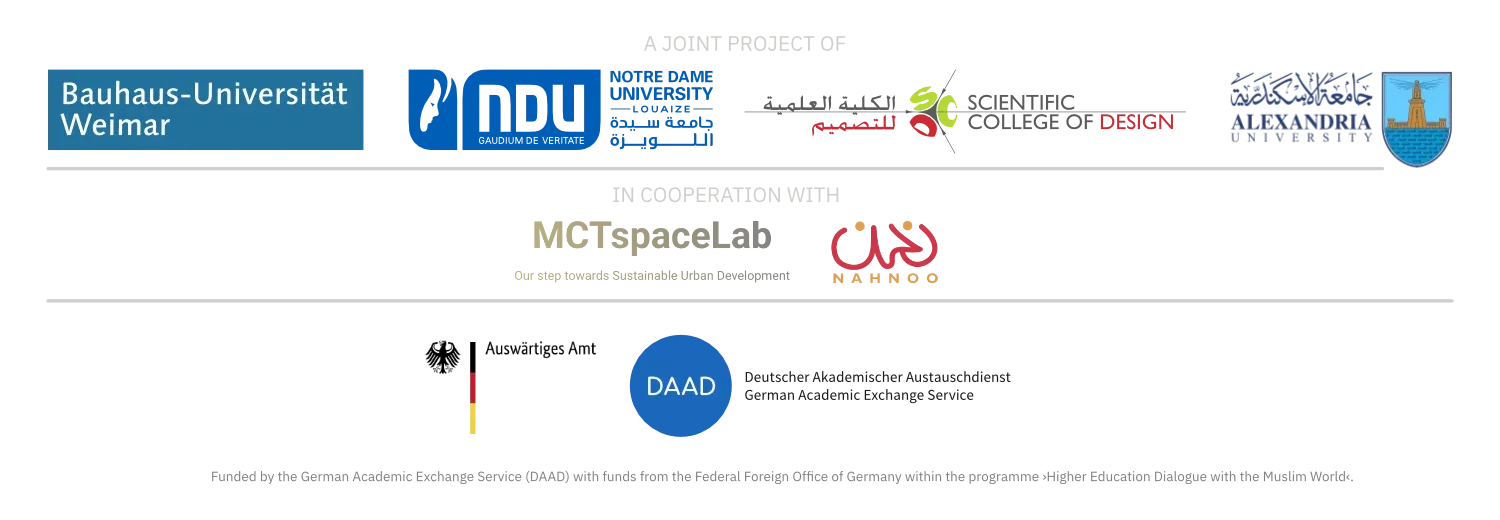
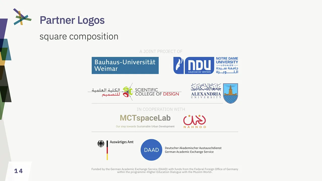
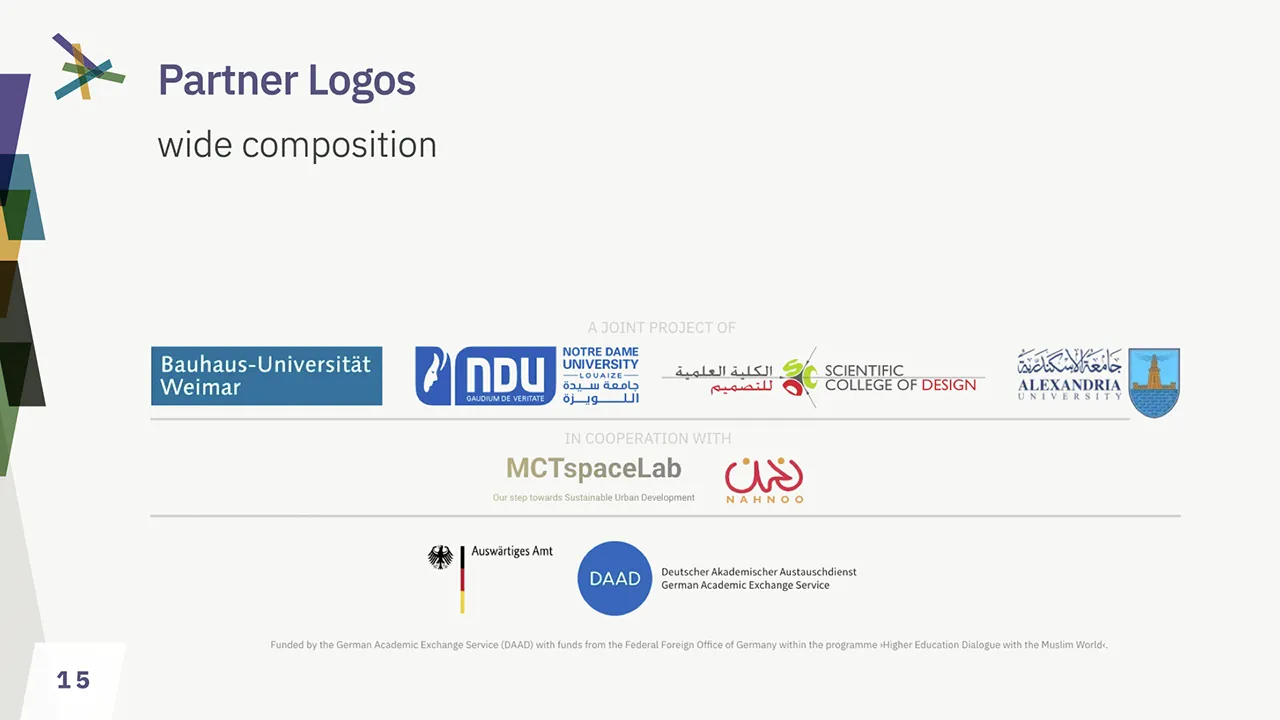
Partner Logo Arrangements
The Project consists of 4 academic partners, funded bei the German Federal Foreign Office’ DAAD program In addition, 2 cooperating partners are part of the project, with more to come, probably.
2 Compositions
These partner and the funders must be represented in a specific order, incl. funding attribution. To avoid mishaps, two compositions are provided which should not be altered.
Atribution Requirements
These compositions are provided here for download. They must be part of every public publication and documentation of the project.
Placement of the Compositions
- Scale carefully – funding attribution must always be readable
- Do not skew, squeeze, rotate, or deform otherwise
- Always use either Sand20 or White for background
- Nether create your own ›composition‹
ZIP file (14.1MB)
- 5 different formats for print & screen
- wide + square composition
Application of the Branding Elements
Social Media Graphics
Graphics for Profile Design
Icon
All popular social networks use a square format for the social media profile icons. The icon provided is a simplified version of the logo so that it is still easily recognizable even when displayed in a small size. It is designed so that it can be displayed within a circular mask without information loss. You are therefore should never crop or scale it.
Profile Header
The profile header graphics do apply to the standards of X, Facebook, LinkedIn, and Instagram.
Post Templates
Social media templates will be provided a.s.a.p.
ZIP archive w/ JPEG files (xyMB)
Roll-Ups and Posters
Roll-Up
The roll-up is a central element of identification for the project on events. It is not intended to be altered by the project partner. It requires professional printing with a service supporting high-res data, CMYK files, and colorprofil support. There are two sizes available:
- 85x200cm (DAAD mention on bottom)
- 65x220cm (special für Bauhaus-Uni Z‑stands, with DAAD mention on top)
The design provides a region-agnostic image of a arabic community discussion city development on a map in public, a general introduction to the project, the list of partners, the sponsor DAAD, and the project contact.
PDF file · v6b 29/05/27 (28MB)
PDF file · v6b 29/05/27 (22MB)
Text Poster
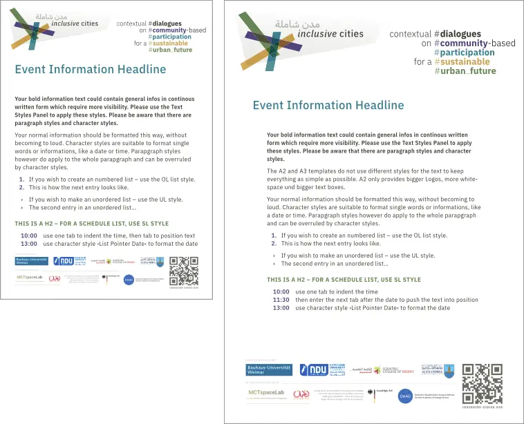
The Text Poster is a quick solution to create Information posters on events – like workshop overviews, day schedules, panel speaker lists, etc. It is optimized for good readability on longer distances and comes in two sizes.
- DIN A3
- DIN A2
It can be easily edited with Affinity Studio and requires the corporate fonts to be installed.
ZIP archive w/ Afiinity Studio file (7MB)
Presentation Templates
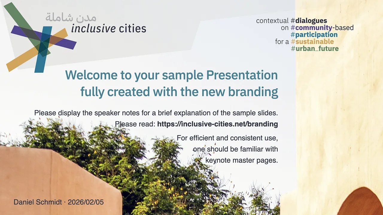
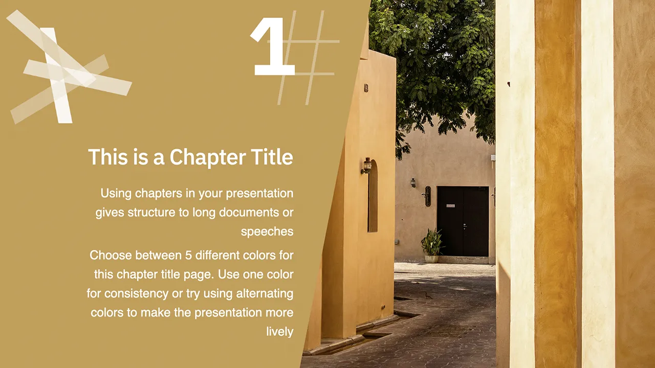
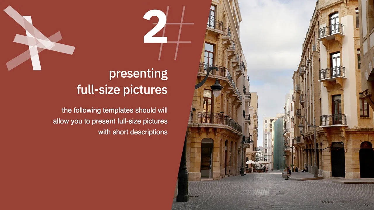
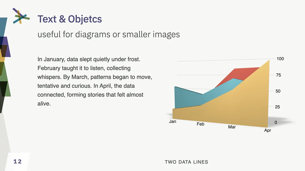
The presentation template uses elements from the website design, but emphasizes practicality and objectivity. The aim is to present content confidently in a way that is clearly perceived as originating from the project.
The template is available for Microsoft PowerPoint in POTX format and as an Apple Keynote file. The corporate font should be installed in order to use it. For technical reasons, it is not possible to embed the fonts in PowerPoint.
The design colors and standard font are predefined within the document in accordance with the corporate identity, as are the most important formatting options.
The template files include self-explanatory instructions in the ›Speaker Notes‹.
How to create your own PowerPoint template
- Open the .POTX file
- Enable slide master editing
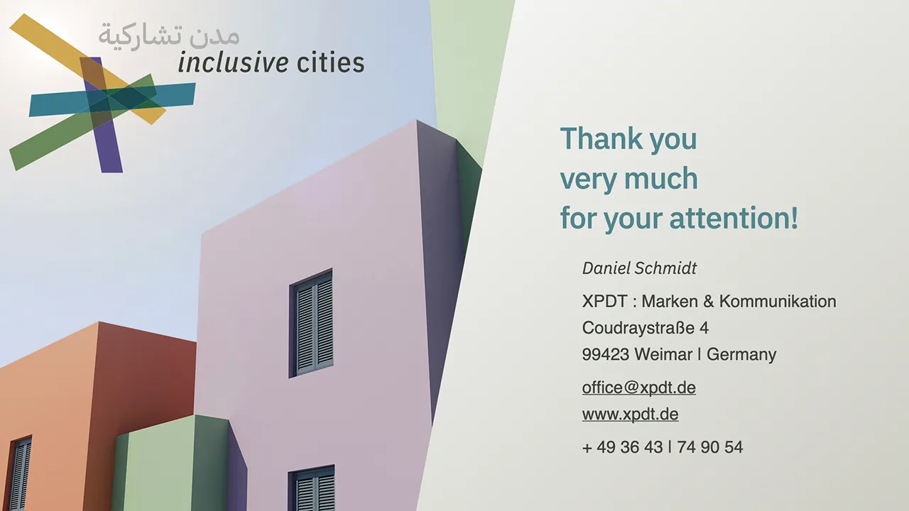
- Customize your name on the first
- page and your name and contact information on the last page
- Exit slide master editing
- Save the document as a PowerPoint template (.POTX) in the template folder suggested by PowerPoint and add your name to the end of the file name.
Using your personalized PowerPoint template
- Create a new document
- Select your personalized template from the template selection
PDF file w/ speaker notes (10.4MB)
ZIP archive w/ PowerPoint potx (9.3MB)
ZIP archive w/ keynote file (9.8MB)
Color Spaces and Profiles
Handling colors and color profiles is a tricky business. Every output device and technologies comes with it’s own features, challenges and limitations. Matching colors for consistant perception is a complex technical process.
Color Profiles are used by all professional software products to match colors. Using the right color space (RGB, CMYK, LAB, HSL, etc.) is as essential as using the right color profile.
This manual does can not discuss the matching of devices within a color sync chain. What we can provide is an advice on which color spaces and color profiles should be used in which process.
Color Spaces and Gamut
XPDT recommends the use of the ECI system of color spaces with the profiles eciRGB_v2 for RGB colors and eciCMYK_v2 for CMYK colors. These profiles are matching, device-independent, wide-gamut color spaces which allow for translation in-between both without color clipping.
We do recommend to set these color profiles as working color space profiles for both, RGB and CMYK, in your applications. We do require to keep them as the color spaces for working documents provided by us.
The advantage of using a wide-gamut profile are colors, not limited by color space, only by devices. Especially older CMYK profiles, and the commonly used sRGB profile, do limit color ranges prior to technical limitations – doubling the color clipping, and leading to poor color rendering, both on screen, and in print.
Using & Installing the color profiles
If you only work with Affinity, these profiles are available within their apps by default, but must be configured in the color settings. For Adobe software, you must install the profiles on your operating system, as Adobe does not include them. Consult the manual of your operating system on how to install the ICC-Profiles.
Choosing the right Profile for professional Print
As lang as you can embed color profiles into your documents, provide files for print in eciCMYK and let the output device cut off what it cannot reproduce.
Avoid to use RGB-Colors for print, and do not use office software for professional print products, as it does not support CMYK colors.
Modern professional dye-based printers can reproduce much more colors than CMYK offset presses. Especially if you are working across borders of economic regions (Euroscale, SWAP, Toyo, etc.), using a locally common CMYK profile (like ISOCoated_v2 or SWAP_v2) with a mismatching output device will result in unpredictable output. Device-independent CMYK like eciCMYK is the only solution.
Colors for Office & Screen
If you are providing material for file formats or working environments not capable of handling color-profiled data, export with sRGB color profile.
This is very likely with HTML-colors for Web, software like Microsoft Office, OpenOffice, LibreOffice, etc. and office and amateur printing hardware, as sRGB is the de-facto standard which all unprofiled devices and software products to try to match as close as possible. Be warned, that sRGB is very limited by design and colors do look washed out no matter how advanced your display or printer is.
If you export from a professional software, like Affinity or Adobe, do color conversion as last step. Do not change the color space of your document, do the color conversion during output by choosing a sRGB as color output profile.
Colors for Web and Social Media
If you provide pictures for a Website, export eciRGB-files with color profiles embedded. It will result in much more precise and vivid colors. Unfortunatelly, the same browsers do not support profiles for HTML and SVG, so this must be exported as sRGB.
ZIP file (1.4MB)
- RGB ICC v2.4 + v4 format
- CMYK ICC v2.4 format